Apple applications have a recognizable appearance. From the familiar heart icon to navigation arrows and audio controls, small visual elements help users understand how an interface works. Behind many of these icons sits SF Symbols, Apple’s extensive system icon library.
Whether you’re building an iPhone application, designing a macOS interface, or learning SwiftUI, SF Symbols can make your work easier. These icons integrate with Apple’s system typography and support different weights, sizes, colors, and animations. You don’t need to design every interface icon from scratch.
However, there’s more to this library than simple pictures. It includes thousands of symbols, multiple rendering modes, customizable variants, dynamic animations, and tools for creating custom artwork.
This guide explains what SF Symbols are, where to find them, and how to use them effectively. You’ll also learn about SwiftUI integration, accessibility, localization, compatibility, and licensing.
What Are SF Symbols?
SF Symbols is Apple’s library of more than 7,000 interface symbols designed to work with the San Francisco system font. Apple introduced the library to help developers create consistent interfaces across its platforms.
These symbols represent familiar actions, objects, settings, and information. Examples include hearts, cameras, calendars, speakers, batteries, and navigation controls.
Unlike ordinary image files, Apple system icons integrate directly with the platform’s typography and interface design. They automatically align with surrounding text and support different weights and scales.
For example, consider a heart icon beside the word “Favorites.” An ordinary image might require manual adjustments to match the text. An SF Symbol can use a matching weight and scale for a more natural appearance.
Apple designs these symbols around its Human Interface Guidelines (HIG). This helps developers maintain visual consistency across buttons, menus, navigation bars, and other interface elements.
What Are SF Symbols Used For?
Developers use SF Symbols throughout Apple applications. Their familiar shapes help people recognize actions without reading lengthy descriptions.
Common applications include:
- Navigation bars: Home, search, settings, and back controls.
- Buttons: Add, delete, share, edit, and save actions.
- Media controls: Play, pause, volume, and microphone controls.
- Status indicators: Battery levels, Wi-Fi connections, and notifications.
- Settings screens: Privacy, security, accessibility, and account options.
- Communication interfaces: Messages, calls, contacts, and email.
- Productivity applications: Calendars, reminders, documents, and notes.
The main advantage is consistency. You can use familiar symbols instead of introducing unrelated icon styles.
How Many SF Symbols Does Apple Provide?
Apple’s current SF Symbols 27 release provides more than 7,000 symbols. The collection continues to evolve as Apple introduces new symbols and updates existing designs.
However, the complete library doesn’t guarantee that every symbol works on every device. Individual symbols have their own operating system availability requirements.
Always check compatibility before using a newer symbol in an application that supports older devices.
What Makes SF Symbols Different From Regular Icons?
At first glance, SF Symbols might look like ordinary vector icons. Their real advantage comes from how they integrate with Apple’s software frameworks.
Traditional icons often require separate files for different sizes, colors, and visual styles. SF Symbols provide built-in configurations that reduce much of this work.
Here are their main advantages:
| Feature | SF Symbols | Regular image icons |
| Typography integration | Designed for San Francisco | Requires manual matching |
| Weights | Nine built-in weights | Usually separate files |
| Scales | Three built-in scales | Often manually resized |
| Rendering | Multiple rendering modes | Depends on image format |
| Animation | Built-in symbol effects | Usually requires custom work |
| Localization | Supports localized variants | Often needs separate assets |
| Integration | Native Apple frameworks | Depends on implementation |
SF Symbols aren’t a replacement for every type of artwork. They work best for interface controls and familiar visual indicators.
For illustrations, product photography, complex branding, and decorative graphics, regular image assets remain useful.
How to Download and Install the SF Symbols App
The SF Symbols app is Apple’s official desktop tool for exploring its symbol library. It helps developers search, inspect, preview, and export symbols.
You can download it through Apple’s official developer resources:
Download SF Symbols from Apple Developer
Apple’s current SF Symbols 27 download requires macOS Sonoma or later.
After downloading the application, open the installer and follow the installation instructions. Once installed, you can explore the symbol collection without repeatedly searching online.
How to Search for SF Symbols
Finding the right icon is straightforward.
- Open the SF Symbols application.
- Browse the available symbol categories.
- Enter a descriptive word in the search field.
- Review matching symbols.
- Select an icon to inspect its details.
- Copy its system name for use in your code.
Apple also provides Enhanced Search, which uses semantic understanding to find relevant symbols.
For example, searching for a concept such as “favorite” can surface related symbols even when their exact names differ.
How to View Symbol Names and Variants
Every system symbol has a specific name. Developers use that name to display the corresponding icon.
For example:
| System name | Meaning |
| heart | Heart outline |
| heart.fill | Filled heart |
| heart.circle | Heart inside a circle |
| heart.slash | Slashed heart |
| speaker.wave.2.fill | Speaker with sound waves |
| speaker.slash.fill | Muted speaker |
| cloud.sun.rain | Sun and rain |
| trash | Delete action |
The SF Symbols app also lets you inspect available weights, scales, rendering layers, and animations.
Understanding SF Symbols Names and Naming Conventions
SF Symbols system names help developers identify individual icons. Apple uses descriptive names that often combine words separated by periods.
For example, heart.fill represents a filled heart. Meanwhile, heart.circle.fill combines a heart, circular enclosure, and filled appearance.
Common naming patterns include:
- Base names: heart, camera, calendar.
- Filled variants: heart.fill, star.fill.
- Slash variants: heart.slash, speaker.slash.
- Circle variants: heart.circle, plus.circle.
- Square variants: square.and.pencil.
These naming conventions make the library easier to search and understand.
However, don’t assume every symbol supports every possible combination. Apple defines the available variants individually.
How to Find the Exact Name of an SF Symbol
The easiest method is using Apple’s official application.
Search for the icon’s purpose rather than guessing its system name. Then select the matching result and copy its exact name.
This small step prevents a common development problem: requesting a symbol that doesn’t exist.
SF Symbols Weights and Scales Explained
One major advantage of Apple SF Symbols is their ability to match surrounding typography.
Apple provides nine weights and three scales. Together, these options give developers considerable control over symbol appearance.
The Nine SF Symbols Weights
Each symbol weight corresponds to a weight in the San Francisco system font.
| Weight | Appearance |
| Ultralight | Extremely thin strokes |
| Thin | Delicate strokes |
| Light | Light visual appearance |
| Regular | Standard appearance |
| Medium | Slightly stronger strokes |
| Semibold | Noticeably emphasized strokes |
| Bold | Heavy visual emphasis |
| Heavy | Very thick strokes |
| Black | Strongest available weight |
For example, a thin symbol beside bold text can look unbalanced. Matching their weights creates a more unified interface.
The Three SF Symbols Scales
Apple also provides three symbol scales:
- Small: Useful when an icon needs less visual emphasis.
- Medium: The default scale for many interface situations.
- Large: Helpful when a symbol needs greater prominence.
The scale changes the symbol’s size relative to surrounding text without changing its font point size.
For the best results, consider the icon’s purpose and nearby typography together.
SF Symbols Design Variants and Their Uses
SF Symbols variants help developers communicate different meanings through related designs.
A filled heart can represent a saved favorite. An outlined heart can indicate an available action. A slashed speaker can communicate muted audio.
These differences help users understand interface states quickly.
Outline and Filled SF Symbols
Outline symbols work well in toolbars, lists, and text-based interfaces.
Filled variants create stronger visual emphasis. They’re especially useful for selected navigation items, active states, and important actions.
Circle and Square Variants
Enclosed symbols place an icon inside a recognizable geometric shape.
For example, heart.circle.fill combines a heart with a filled circular background. These designs can improve visibility in compact interface areas.
Slash Variants
Slash variants communicate unavailable, disabled, or reversed states.
Examples include:
- speaker.slash.fill for muted audio.
- bell.slash for disabled notifications.
- heart.slash for an unavailable heart-related action.
Always choose variants according to their actual meaning rather than appearance alone.
SF Symbols Rendering Modes Explained
SF Symbols rendering modes control how Apple applies colors to symbol layers.
Apple provides four main rendering modes: Monochrome, Hierarchical, Palette, and Multicolor.
Each mode creates a different appearance and serves different interface needs.
Monochrome Rendering
Monochrome rendering displays a symbol using one color.
It’s the simplest option for standard interface controls and minimal designs.
For example, a black search icon on a white background uses a straightforward monochrome appearance.
Hierarchical Rendering
Hierarchical rendering uses different opacity levels across symbol layers.
The foreground style creates visual depth without requiring several unrelated colors.
This works well for layered symbols such as weather icons, where some elements need greater emphasis.
Palette Rendering
Palette rendering allows developers to apply different colors to individual symbol layers.
For example, a weather symbol could use yellow for the sun and blue for rain.
This mode offers greater control over the icon’s appearance.
Multicolor Rendering
Multicolor rendering uses the symbol’s built-in colors where available.
Apple designs certain symbols with intrinsic color treatments. This makes them useful when their original appearance communicates meaning more clearly.
Gradient Rendering
SF Symbols 7 introduces gradient rendering as an additional styling capability.
Gradients create smooth color transitions across symbols. They can add depth and visual interest without requiring developers to create separate artwork.
Apple supports gradients across rendering modes and custom symbols.
How to Change SF Symbols Colors in SwiftUI
SwiftUI provides modifiers for adjusting symbol appearance.
For example:
Image(systemName: “heart.fill”)
.foregroundStyle(.red)
You can also choose a rendering mode:
Image(systemName: “cloud.sun.rain.fill”)
.symbolRenderingMode(.multicolor)
For layered colors, use palette rendering:
Image(systemName: “cloud.sun.rain.fill”)
.symbolRenderingMode(.palette)
.foregroundStyle(.yellow, .blue, .gray)
The available layers depend on the selected symbol. A symbol that doesn’t support your chosen rendering mode may fall back to monochrome.
How to Use SF Symbols in SwiftUI
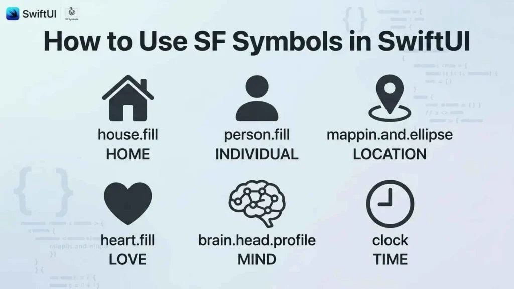
SwiftUI makes integrating SF Symbols particularly simple. You don’t need to download individual icon files or manually manage standard system artwork.
The Image(systemName:) initializer displays a symbol using its system name.
How to Add an SF Symbol Using Image(systemName:)
Start with a basic example:
import SwiftUI
struct ContentView: View {
var body: some View {
Image(systemName: “heart.fill”)
.font(.largeTitle)
.foregroundStyle(.red)
}
}
This example displays a red filled heart.
The .font() modifier controls its typography-related size and weight. The .foregroundStyle() modifier controls its appearance.
How to Use SF Symbols Inside Buttons
Symbols can make interactive controls easier to recognize.
Button(action: {
print(“Favorite selected”)
}) {
Label(“Add to Favorites”, systemImage: “heart”)
}
The Label view combines an icon with descriptive text.
This approach is useful because it gives users both visual and written information.
How to Customize SF Symbols in SwiftUI
You can adjust several properties using standard SwiftUI modifiers.
Image(systemName: “star.fill”)
.font(.system(size: 28, weight: .semibold))
.foregroundStyle(.orange)
.symbolRenderingMode(.hierarchical)
This example creates an orange star with a semibold appearance.
You can also change symbol weight, scale, color, and rendering mode independently.
How to Use SF Symbols With SwiftUI State
Symbols become especially useful when they respond to application changes.
For example, a favorite button can switch between outlined and filled hearts.
import SwiftUI
struct FavoriteButton: View {
@State private var isFavorite = false
var body: some View {
Button {
isFavorite.toggle()
} label: {
Image(systemName:
isFavorite ? “heart.fill” : “heart”
)
}
.foregroundStyle(.red)
}
}
The @State property stores the current selection. When the user taps the button, SwiftUI updates the displayed symbol.
Using SF Symbols in UIKit and AppKit
SF Symbols aren’t limited to SwiftUI. Developers can also use them through UIKit and AppKit.
UIKit supports iOS and iPadOS interfaces. AppKit provides native macOS interface components.
| Framework | Symbol-loading method | Typical platform |
| SwiftUI | Image(systemName:) | Apple platforms |
| UIKit | UIImage(systemName:) | iOS and iPadOS |
| AppKit | NSImage(systemSymbolName:) | macOS |
In UIKit, you can create a system image like this:
let image = UIImage(systemName: “camera.fill”)
In AppKit, use:
let image = NSImage(
systemSymbolName: “camera.fill”,
accessibilityDescription: “Camera”
)
Both frameworks support symbol configuration and customization. Check Apple’s documentation for framework-specific availability and configuration options.
SF Symbols Animations and Built-In Effects
Static icons communicate information. Animated icons can communicate change.
SF Symbols animations help developers show interactions, status updates, and ongoing activity without introducing complicated visual effects.
Common effects include Bounce, Pulse, Wiggle, Rotate, and Breathe.
| Animation | Typical purpose |
| Bounce | Draw attention to a change |
| Pulse | Indicate activity |
| Wiggle | Highlight an interactive element |
| Rotate | Show rotation or movement |
| Breathe | Create gentle repeated motion |
| Scale | Emphasize a state change |
| Draw On | Reveal a symbol along its path |
| Draw Off | Remove a symbol along its path |
How to Apply SF Symbols Animations in SwiftUI
SwiftUI provides the symbolEffect() modifier.
Here’s a simple example:
Image(systemName: “bell.badge.fill”)
.symbolEffect(.bounce, value: notificationCount)
The animation responds when notificationCount changes.
Apple also introduced more advanced drawing animations in SF Symbols 7.
Draw On reveals a symbol along its designed path. Draw Off animates the reverse process. Developers can configure these effects to animate by layer, as a complete symbol, or individually.
These features work particularly well for progress indicators and visual transitions.
Variable SF Symbols and Dynamic Value Rendering
Some interface elements represent changing values rather than simple on-and-off states.
For example, a battery icon needs to communicate remaining charge. A speaker symbol may need to represent different volume levels.
Variable SF Symbols address this requirement through dynamic rendering.
Important examples include:
- Wi-Fi signal strength.
- Battery charge.
- Speaker volume.
- Microphone input.
- Download progress.
- Cellular signal strength.
Variable Color and Variable Draw
Variable Color changes the appearance of symbol layers according to a value.
Variable Draw uses drawing progress to represent changing values. SF Symbols 7 expands these capabilities with more precise progress visualization.
For example, a download indicator could gradually reveal its drawing as a file downloads.
These symbols provide useful visual feedback without requiring separate icons for every possible value.
Magic Replace and SF Symbols Transitions
Magic Replace creates smoother transitions when an application switches between related symbols.
Imagine a music player. When someone presses Play, the interface changes from a play icon to a pause icon.
A basic replacement instantly swaps one symbol for another. Magic Replace can animate their shared visual elements to create a more natural transition.
Common examples include:
- Play and pause.
- Muted and unmuted speakers.
- Selected and unselected favorites.
- Active and inactive notifications.
SF Symbols 7 improves Magic Replace with enclosure matching and integration with Draw animations.
SwiftUI also provides symbol-related content transitions:
Image(systemName: isPlaying ? “pause.fill” : “play.fill”)
.contentTransition(.symbolEffect(.replace))
The transition makes related symbol changes feel more connected.
SF Symbols Localization and Right-to-Left Support
An icon that works in one language might need adjustments in another.
SF Symbols localization helps Apple applications maintain appropriate visual communication across different writing systems.
Apple provides localized symbol designs for more than 20 international scripts.
These include Arabic, Hebrew, Chinese, Japanese, Korean, and several other writing systems.
Right-to-Left Language Support
Languages such as Arabic and Hebrew use right-to-left reading directions.
Some directional symbols need to change their orientation to match the interface. Apple supports automatic adaptation for applicable symbols.
However, developers shouldn’t assume that every icon needs mirroring.
A camera, heart, or settings icon usually retains its appearance. A forward-facing navigation arrow may need directional adaptation.
Always test your application in different language settings before release.
SF Symbols Accessibility Best Practices
An attractive interface isn’t necessarily an accessible one.
SF Symbols accessibility involves choosing recognizable icons and ensuring assistive technologies can communicate their purpose.
Using SF Symbols With VoiceOver
VoiceOver reads interface information aloud for people who use screen readers.
Decorative symbols don’t always need separate accessibility descriptions. However, an icon-only button should communicate its action clearly.
For example:
Button {
deleteItem()
} label: {
Image(systemName: “trash”)
}
.accessibilityLabel(“Delete item”)
The accessibility label explains the button’s purpose.
Color Contrast and Visual Clarity
Never rely on color alone to communicate an important state.
For example, a red icon might indicate an error. However, adding a warning symbol and descriptive text makes the message easier to understand.
Follow these practices:
- Choose recognizable symbols.
- Maintain sufficient color contrast.
- Add accessibility labels to icon-only controls.
- Avoid unnecessary animations.
- Support Dynamic Type where appropriate.
- Respect reduced-motion accessibility preferences.
How to Create Custom SF Symbols
Apple’s library covers thousands of common interface needs. However, some applications require unique symbols for specialized features.
Custom SF Symbols allow designers to create original artwork that follows Apple’s symbol design conventions.
The process begins with compatible vector artwork and Apple’s symbol templates.
Custom Symbol Creation Workflow
- Find an existing symbol that resembles your intended design.
- Download an appropriate template from the SF Symbols app.
- Open the template in a compatible vector graphics editor.
- Create artwork using Apple’s alignment and drawing guides.
- Prepare the required weights and scales.
- Organize layers and annotations.
- Import the artwork into the SF Symbols app.
- Inspect its appearance and test different rendering modes.
- Export and integrate the finished symbol into your project.
Apple also supports annotations that enable custom drawing animations.
For example, guide points can define how a symbol’s paths appear during Draw On and Draw Off effects.
Custom symbols should follow Apple’s design specifications. Avoid hidden paths, unnecessary effects, and inconsistent proportions.
SF Symbols Compatibility and Operating System Availability
Not every SF Symbol works across every Apple operating system.
Apple introduces new symbols with software releases. Consequently, an icon available on a newer iOS version might not exist on an older device.
Check each symbol’s availability before adding it to your application.
Consider these platforms:
- iOS and iPadOS.
- macOS.
- watchOS.
- tvOS.
- visionOS.
Your application’s deployment target also matters. A newer SDK doesn’t automatically make every newer symbol available on older operating systems.
What Happens When an SF Symbol Is Unavailable?
If a requested system name doesn’t exist on the current operating system, the image initializer may return no image.
Developers should provide a sensible fallback.
For example, an application might display a simpler supported symbol when a newer decorative variant isn’t available.
Always test on the oldest operating system version your application supports.
SF Symbols Licensing and Commercial Use
Developers should understand Apple’s licensing requirements before distributing applications containing SF Symbols.
Apple provides its symbol library under specific usage terms. These terms govern how developers can use, modify, and distribute the artwork.
In general, developers can use permitted SF Symbols within compatible application interfaces. However, that doesn’t mean every symbol can become a standalone logo or branding asset.
Important considerations include:
- Follow Apple’s current SF Symbols license.
- Don’t assume unrestricted redistribution is permitted.
- Check restrictions involving Apple’s trademarks and branding.
- Don’t use symbols to suggest an official Apple endorsement.
- Review the rules before using symbols outside their intended application context.
Can you use SF Symbols commercially? Yes, when your intended use follows Apple’s applicable license.
Read the current SF Symbols license and official developer resources before commercial distribution.
Common SF Symbols Problems and How to Fix Them
Even though SF Symbols are straightforward to implement, developers sometimes encounter unexpected behavior.
| Problem | Possible cause | Solution |
| Symbol doesn’t appear | Incorrect system name | Verify the exact name |
| Icon looks different | Different rendering mode | Check symbol configuration |
| Symbol is unavailable | Older operating system | Provide a fallback |
| Animation doesn’t work | Unsupported effect or API | Check framework availability |
| Colors look incorrect | Unsupported rendering mode | Inspect symbol layers |
| Icon looks misaligned | Incorrect weight or scale | Match surrounding typography |
| Custom symbol renders poorly | Incorrect annotations or artwork | Review Apple’s templates |
A useful troubleshooting habit is to test symbols in the SF Symbols app before implementing them.
This helps identify unsupported variants and rendering limitations early.
SF Symbols vs. Custom Icons: Which Should You Use?
Both options have advantages. The right choice depends on your application’s purpose and visual identity.
| Comparison | SF Symbols | Custom icons |
| Design consistency | Follows Apple’s conventions | Depends on your design |
| Customization | Built-in options | Greater creative control |
| Typography matching | Native integration | Requires adjustments |
| Animation | Built-in supported effects | Often requires custom animation |
| Branding | Limited | Excellent |
| Maintenance | Convenient for standard icons | Requires asset management |
| Platform integration | Strong within Apple frameworks | Depends on implementation |
When Should You Use SF Symbols?
Choose SF Symbols when building standard interface elements.
They’re particularly useful for navigation, settings, notifications, media controls, and familiar actions.
When Do Custom Icons Make More Sense?
Custom artwork is better when your application needs a distinctive brand identity or specialized visual language.
For example, a fitness application might need unique exercise illustrations that Apple’s standard library doesn’t provide.
You can also combine both approaches. Use SF Symbols for familiar controls and custom artwork for branded experiences.
Best Practices for Using SF Symbols in App Design
A good icon should communicate its purpose quickly. It should also fit naturally into the surrounding interface.
Follow these practical recommendations:
- Choose recognizable symbols: Avoid obscure icons when familiar alternatives exist.
- Match typography: Use compatible symbol weights and scales.
- Select appropriate variants: Make selected and unselected states easy to distinguish.
- Use colors carefully: Don’t introduce unnecessary visual complexity.
- Keep animations meaningful: Motion should communicate a change or provide feedback.
- Support accessibility: Add descriptive labels to icon-only controls.
- Test localization: Check directional symbols in right-to-left languages.
- Check compatibility: Verify availability across supported operating systems.
- Follow Apple’s guidelines: Maintain consistency with native interface conventions.
Most importantly, don’t use an icon simply because it looks attractive. Its meaning should be clear to the people using your application.
Frequently Asked Questions About SF Symbols
What Are SF Symbols Used For?
SF Symbols are Apple’s system icons for application interfaces. Developers use them for navigation, buttons, menus, settings, notifications, and other interface elements.
Is the SF Symbols App Free to Download?
Apple provides the SF Symbols application as a free developer resource. You can download it through Apple’s official website. The current SF Symbols 27 download requires macOS Sonoma or later.
How Many SF Symbols Are Available?
Apple provides more than 7,000 symbols in its current SF Symbols library. The collection changes as Apple introduces new symbols and updates existing designs.
Are SF Symbols Open Source?
No. SF Symbols aren’t an open-source icon library. Apple provides them under its own licensing terms, which developers should review before use.
Do SF Symbols Work in SwiftUI and UIKit?
Yes. SwiftUI uses Image(systemName:), while UIKit supports UIImage(systemName:). macOS developers can use the corresponding AppKit APIs.
Can You Use SF Symbols in Commercial Applications?
Yes, provided your use follows Apple’s applicable licensing requirements. Commercial use doesn’t remove restrictions on redistribution, trademarks, or branding.
Can You Customize SF Symbols Colors?
Yes. Developers can use monochrome, hierarchical, palette, and multicolor rendering modes. SF Symbols 7 also supports gradient styling.
Do SF Symbols Support Dark Mode?
SF Symbols can adapt to light and dark appearances through system colors and interface styling. However, developers should test contrast and visibility in both modes.
Do SF Symbols Support Right-to-Left Languages?
Yes. Apple provides localized symbol variants and automatic directional adaptation for applicable symbols. Not every symbol needs mirroring.
Can You Create Your Own SF Symbols?
Yes. Apple provides templates and tools for creating custom symbols. You can design compatible artwork and add annotations for supported rendering and animation features.
Why Isn’t an SF Symbol Appearing in My App?
The system name might be incorrect or the symbol might require a newer operating system. Check the exact name and availability, then provide a fallback when necessary.
Can You Use SF Symbols as an App Icon?
SF Symbols are primarily designed for interface elements. They shouldn’t automatically be treated as unrestricted app branding artwork. Review Apple’s licensing terms and app icon design requirements before using them for this purpose.
Final Thoughts on SF Symbols
SF Symbols gives Apple developers a powerful way to build consistent and recognizable application interfaces. Its extensive library includes thousands of symbols with different weights, scales, variants, and rendering options.The real advantage goes beyond convenience. These icons integrate with Apple’s typography, support localization, and offer built-in animation capabilities.Whether you’re using SwiftUI, UIKit, or AppKit, you can add familiar interface symbols without managing thousands of individual image files.Start with the official SF Symbols app and explore the available designs. Then experiment with rendering modes, variable values, and animations as your application grows.
Most importantly, choose symbols that communicate clearly. A well-designed icon doesn’t just decorate an interface. It helps people understand what to do next.

I am Lisa Reynolds, a linguist fascinated by the ever-changing world of slang. I enjoy researching how slang reflects trends, technology, and social connections. I wrote “Text Talk: Understanding Digital Slang” and “From Street to Screen: Slang in Media”, exploring the influence of digital communication on language. I love sharing my discoveries in a way that feels like a conversation with friends, so you feel the culture and humor behind every phrase.
 John Carter